Sentinel Workbooks: Deploy and Customise Your First Dashboard

Welcome back class.
You're running Sentinel. Logs are flowing. Alerts are firing. And your team is copy-pasting the same KQL query into Log Analytics fifty times a day because nobody bothered to build a dashboard. That's where this stops. Workbooks aren't fancy; they're mandatory in many situations, especially when you want to visualise something you are looking at every single day. Total number of alerts this week, separated into Low, Mediums and High? Which machine sends the most logs over the course of 30 days? This post shows you how to get one live in fifteen minutes using something Microsoft already built, then make it actually useful.
Why Logs Alone Are Not Enough?
Raw KQL queries answer one question at a time. "How many incidents this week?" "Which workspace is noisiest?" "Is my connector dead?" You run the query, get an answer, close Log Analytics, and repeat tomorrow.
A workbook answers all three at once. One screen. One set of filters. Real patterns can emerge - you spot that the East US region is exploding with incidents, or that one workspace hasn't ingested data in six hours, and nobody noticed. When used correctly, there are not only dashboards that your CEO loves, but they will also give you a lot of data and trends you can work with.
Content Hub: Microsoft Did The Work For You
Sentinel ships with pre-built workbooks ready to deploy. Actual dashboards. Dozens of them. Office 365, Azure Activity, Defender integration, MITRE ATT&CK mapping, it's all there, free, already tested.
Here's how to deploy them:
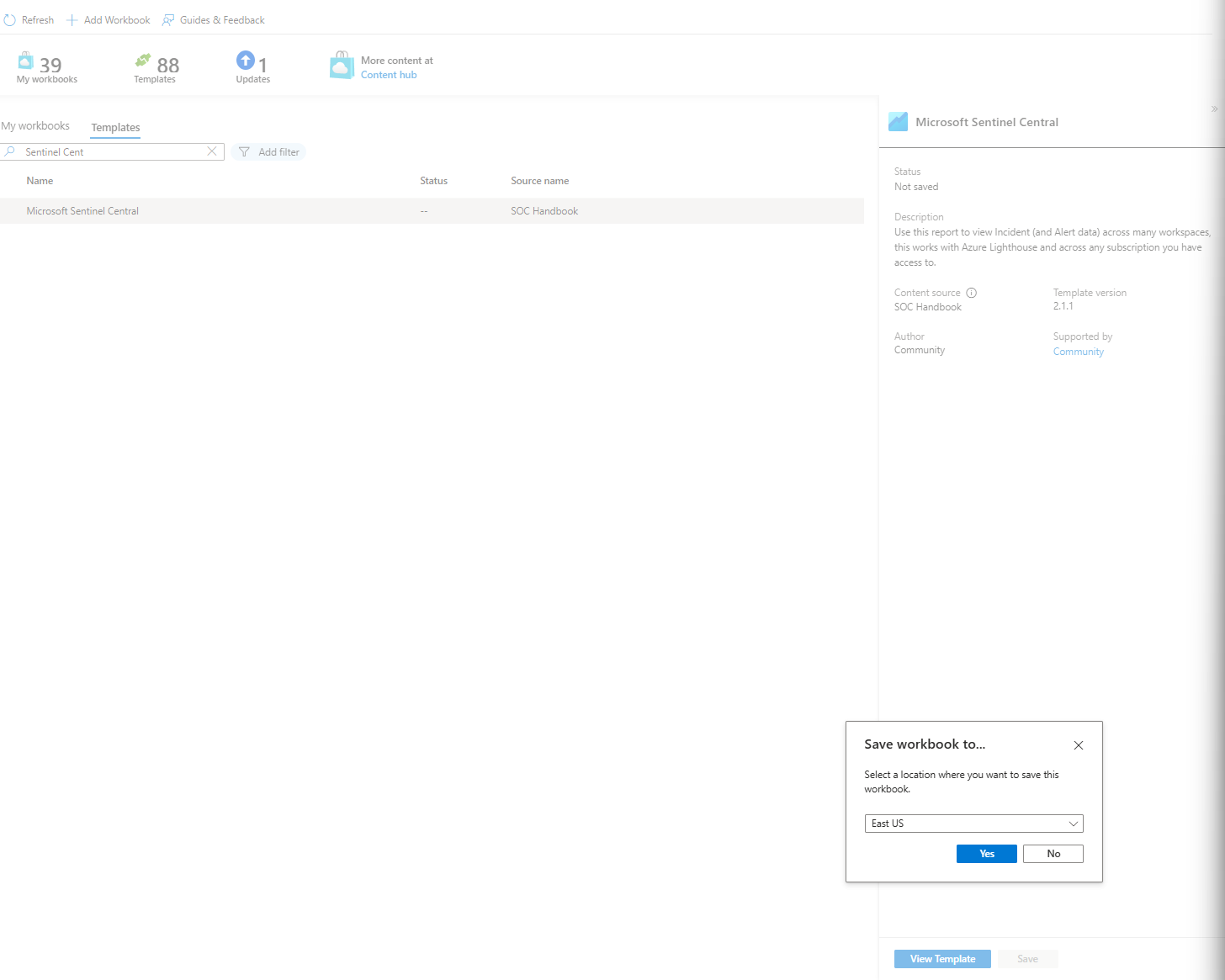
- Open Sentinel > Content Hub
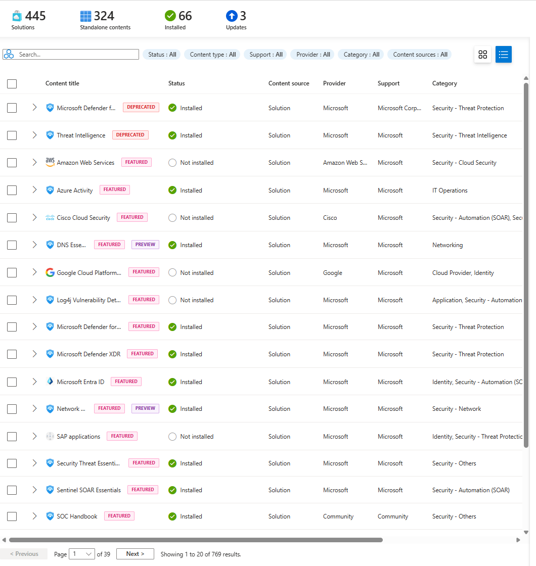
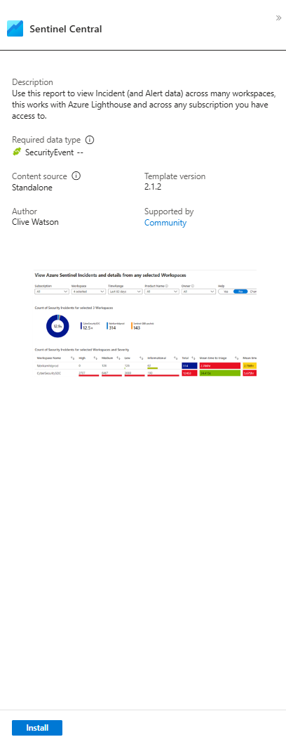
- Search "Sentinel Central" (this is the one I'm using as an example; it pulls incidents across all your workspaces)
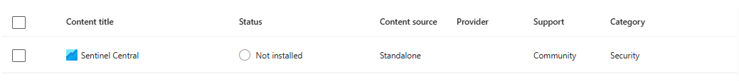
- Click Install
- Go to Workbooks > Templates> Sentinel Central
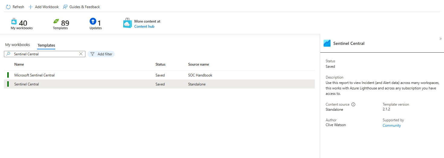
- Save it (ideally always stick to the same location of your tenant, so if you have UK South, don't pick up EU West)
Done. You've got a dashboard. No configuration. No JSON editing. No crying.
What You're Actually Looking At
Open Sentinel Central and you'll see this layout:
The Filter Bar at the Top
Region. Subscription. Workspace. Time Range. Product Name. Owner. This is your command centre. Change one dropdown, and everything below refreshes. Most people miss this entirely; they think the dashboard is static. It's not. These filters are where all the power lives, and they are amazing!

Test it: Click "Last 7 days" and switch to "Last 24 hours". Watch all the numbers drop and recalculate. That's the entire dataset re-slicing in real-time based on one dropdown. This is why you needed a workbook instead of a static report.
The Incident Count Display
Big number. Probably large. This is your "how bad is today?" indicator.
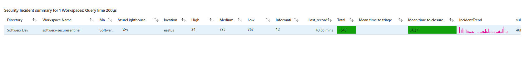
Below it sits a table showing incidents by workspace with colour-coded severity. Red rows mean high-severity incidents in that workspace. Yellow means medium. Green means low (a bit counterintuitive as Sentinel's Low = Yellow) You don't need to read anything, the colours tell you where the noise is.
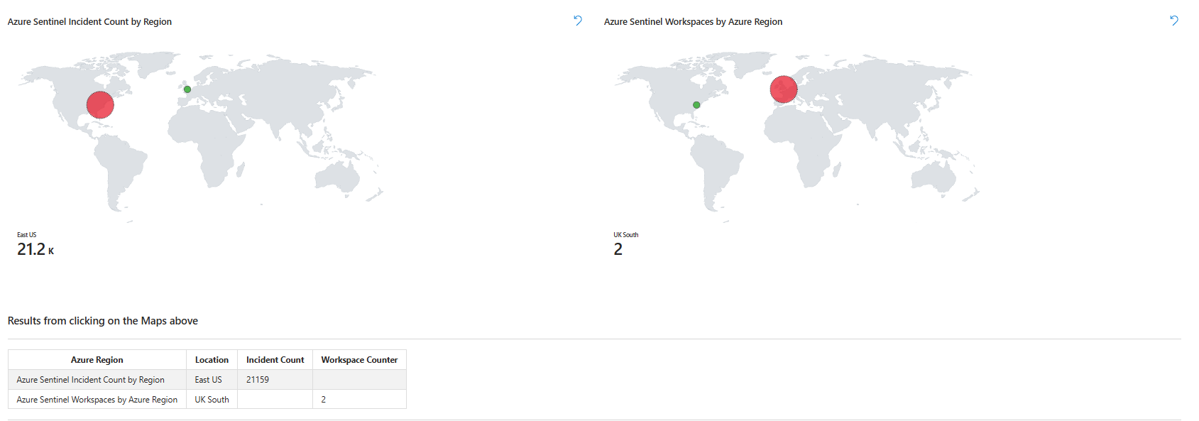
Two Maps You Actually Need to Understand
Left map: incidents by Azure region. If you see East US glowing red with 150 incidents and West Europe is dark green with three, you know the attack is concentrated.
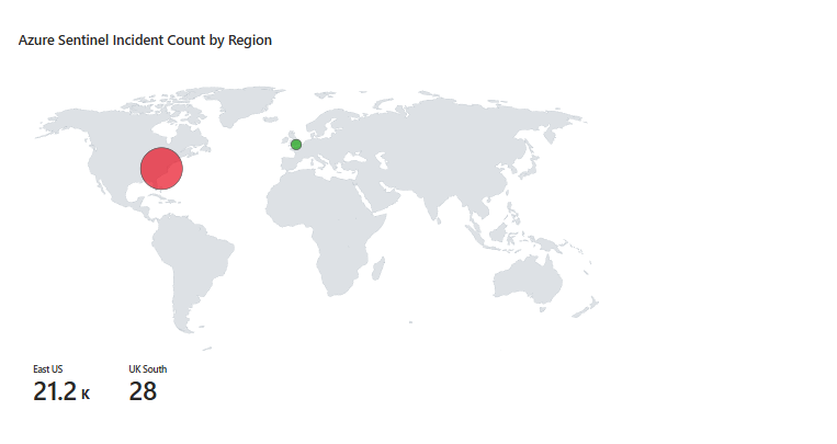
Right map: Which regions house your Sentinel workspaces? Different thing, one shows where attacks are hitting, the other shows where your infrastructure lives.
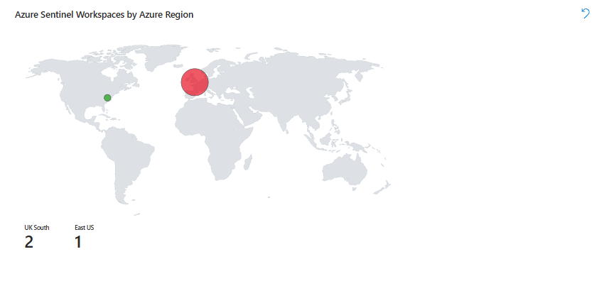
Below both maps is a table. Click a region on the map, and the table updates, showing which workspaces are in that region. This is where you drill down when a region suddenly goes hot.
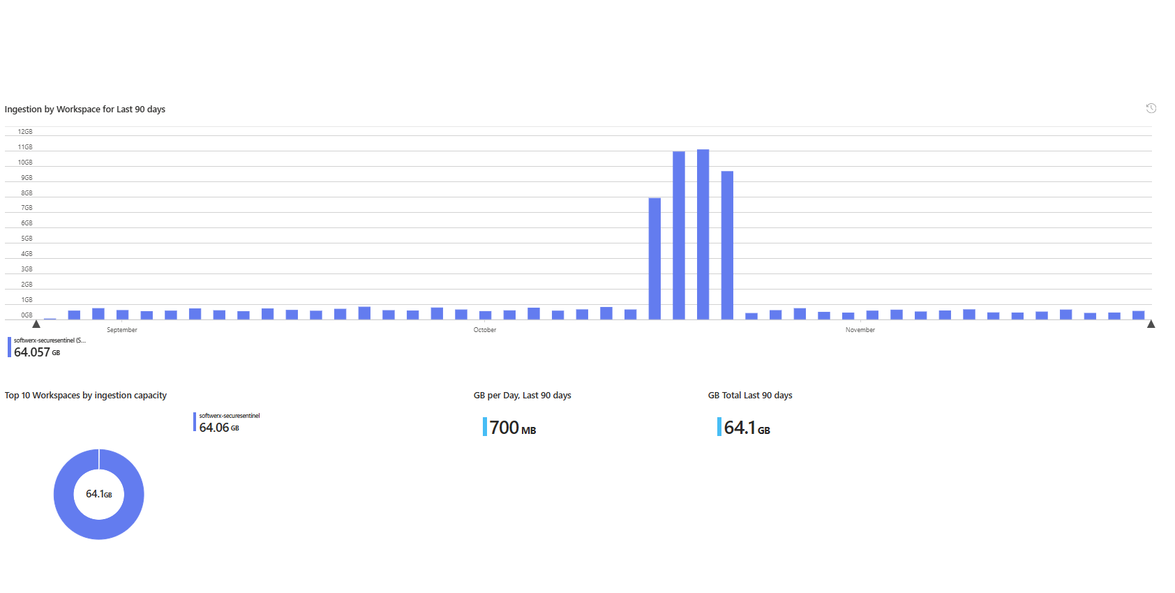
Ingestion Health Section
Pie chart showing which workspaces are eating your GB budget. Below it, a bar chart showing daily ingestion over 90 days. If a workspace suddenly drops to zero GB on a day when it should be pulling data, your connector died, and you didn't notice. You're flying blind.
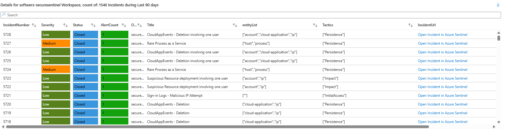
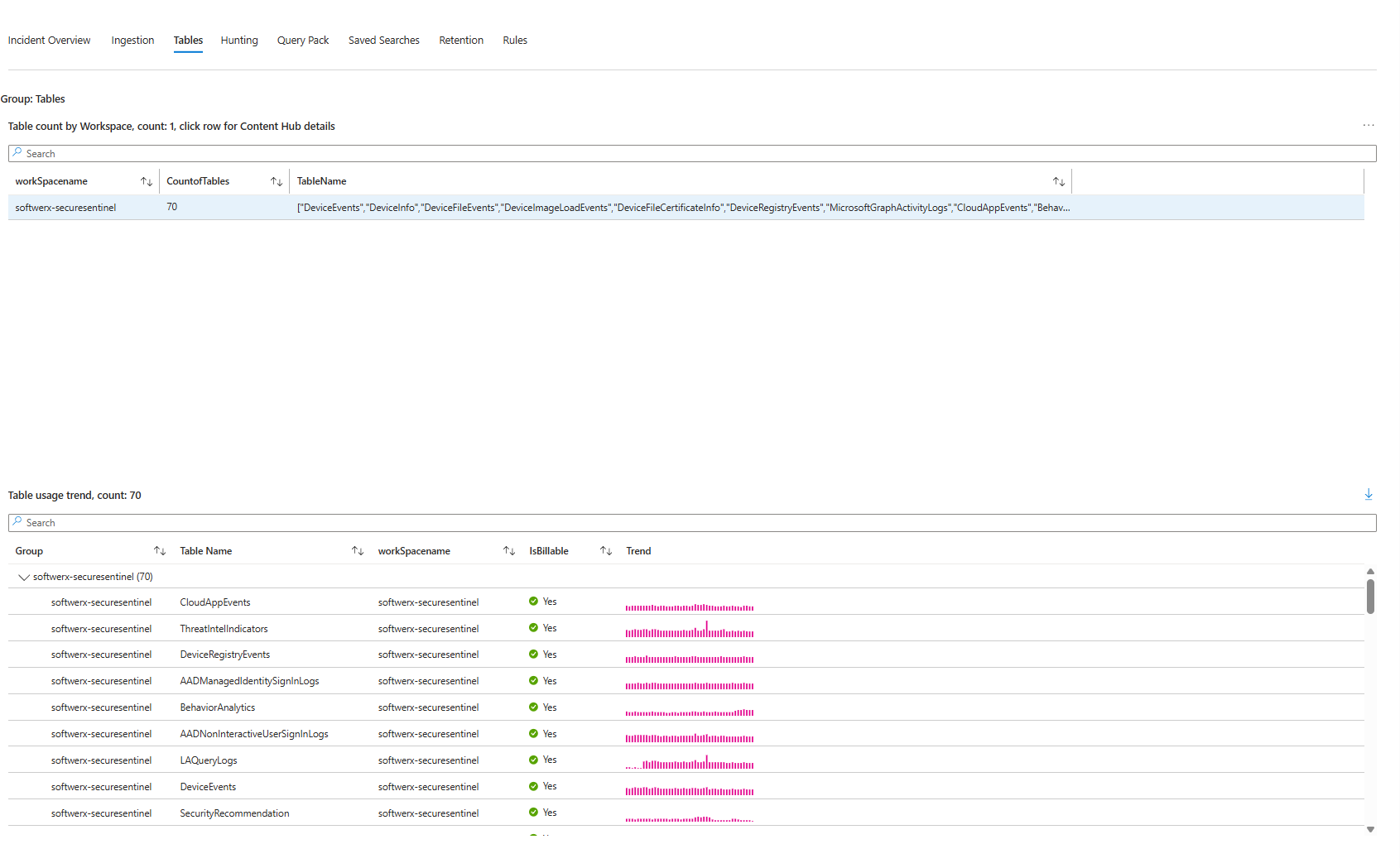
Tables Tab: What's Actually Stored
Switch to the Tables tab. You'll see every table in your workspace(s), their size, whether they're billable, and their trend. SecurityEvent is probably massive. AlertInfo is probably small. This tab is your cost control centre. If DeviceEvents is suddenly 5GB a day when it was 500MB last week, something changed, and you need to know why.
How to Actually Customise It So You Use It Daily
The dashboard works out of the box. It's also generic. You need to make it answer your questions, not Microsoft's. This is where people give up, they think editing a workbook requires JSON or PowerShell. It doesn't. It's drag-and-drop.
Step 1: Click Edit
Top toolbar. Edit button. You're in edit mode. Everything becomes movable and changeable.

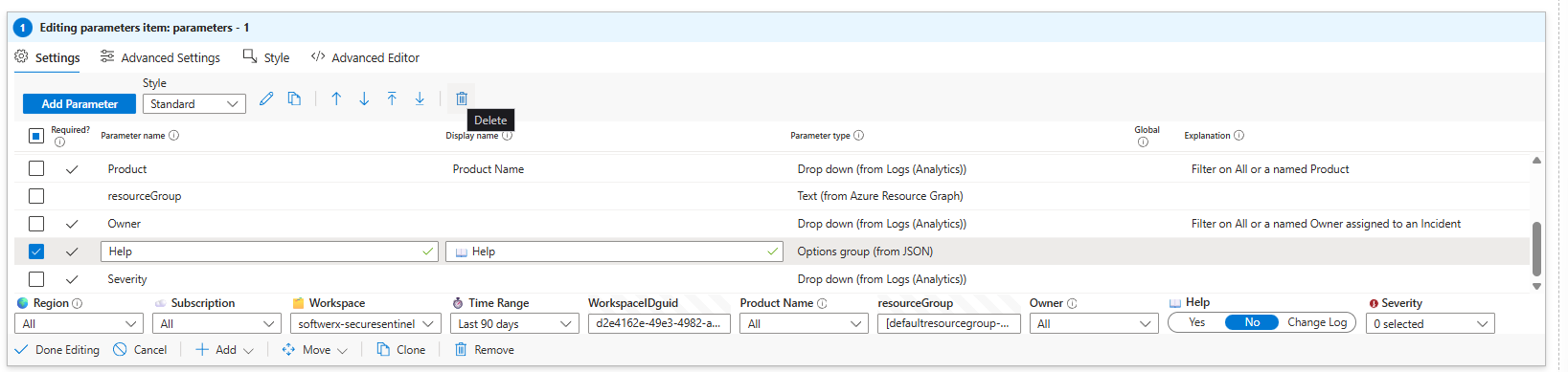
Step 2: Add a Severity Filter That Actually Does Something
Here's where most people mess up: they create a dropdown, leave it empty, then wonder why nothing filters. The dropdown needs values. You pull those values from your actual data using a query.
Click Add parameters. Name it "Severity". Type is dropdown. Now click "Get data from" and select Query. Paste this:
SecurityIncident
| summarize count() by Severity
| project Severity
Run it. You'll see Low, Medium, High, Informational come back as actual options. That's your dropdown populated from real incidents in your workspace. If your environment has different severity values (or none), this query will show you exactly that. Save the parameter.
Step 3: Connect the Filter to Your Incident Query
Adding a filter that doesn't filter anything is pointless. You need to wire it into the query showing your incidents.
Add a query visualisation. Paste this KQL. It's the real incident query, now with the Severity parameter wired in:
SecurityIncident
| extend stringtoSplit = split("{WorkspaceIDguid}",",")
| where Severity == '{Severity:label}'
| mv-expand stringtoSplit
| where stringtoSplit has TenantId
| extend workSpacename = trim(@"[^\w]+",tostring(split(stringtoSplit,":").[1]))
| where tolower(workSpacename) == tolower('{iWorkspace}')
| summarize arg_max(TimeGenerated,*) by tostring(IncidentNumber)
| extend Alerts = extract("\\[(.*?)\\]", 1, tostring(AlertIds))
| extend productName_ = tostring(parse_json(tostring(AdditionalData.alertProductNames))[0])
| where productName_ in ({Product}) or '{Product:label}' =="All"
| mv-expand AlertIds to typeof(string)
| join
(
    SecurityAlert
    | extend AlertEntities = parse_json(Entities)
    | mv-expand AlertEntities
) on $left.AlertIds == $right.SystemAlertId
| summarize AlertCount=dcount(AlertIds), entityList=make_set(tostring(AlertEntities.Type)) by IncidentNumber, Status, Severity, Title, Alerts, IncidentUrl, Owner=tostring(Owner.userPrincipalName), Tactics=tostring(AdditionalData.tactics), workSpacename, productName_
| project workSpacename, IncidentNumber, Severity, Status, AlertCount, Owner, Title, entityList, Tactics, IncidentUrl, productName_
| order by IncidentNumber desc
See this line: | where Severity == '{Severity:label}'
That's the magic. When someone picks "High" from the dropdown, the query substitutes {Severity:label} with "High" and re-runs. You get only high-severity incidents. Pick "Medium", it filters to medium. This is what makes the dashboard interactive instead of static.
Test it. Change the Severity dropdown. Watch the table update instantly with only that severity level. If it's empty when you select something, either you don't have incidents at that severity, or the field names don't match your actual table schema. Check Log Analytics directly to verify field names if it breaks.
Step 4: Delete The Change Log Because Nobody Cares
Sentinel Central has a "Change Log" section at the top listing every version update. Nobody opens the dashboard to read patch notes. Delete it. Hover over the section in edit mode, click the trash icon, and save. Gone.
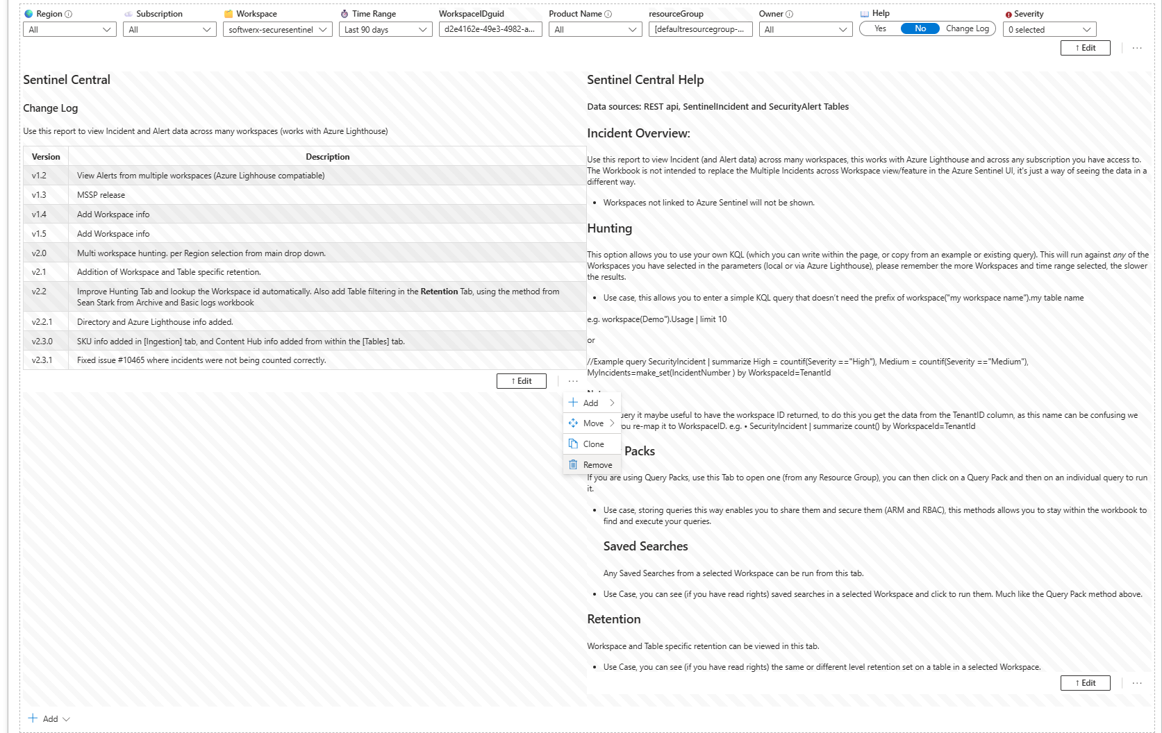
You can do the same with the "Help" parameter to keep that tab nice and clean.
Step 5: Save It as Your Own Version
Click "Save As" (in edit mode). Give it a name like "Sentinel Central - SOC Focus". Pick your workspace as the location. Save.
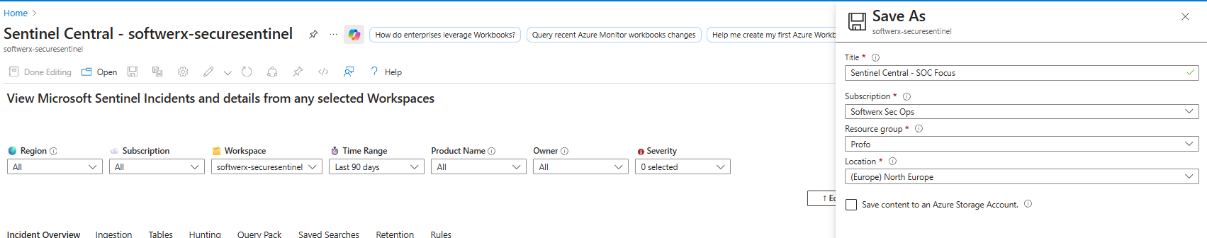
You now have your own copy. The original stays unchanged. Microsoft's updates to the original don't touch your version. You're free to break it without guilt.
The Filters That Actually Matter
Most SOCs use these five. Add them if they're not already there:
Workspace - Which workspace are you looking at? Essential for multi-workspace environments.
Time Range - Last 24 hours by default. But you need 7-day and 30-day views for trend spotting.
Severity - High, Medium, Low. Lets you silence informational noise instantly.
Status - Open or Closed. Stops resolved incidents from cluttering your overview.
Owner - Sometimes you want to check what the user was up to or how many incidents were done in a day.
That's it. Five filters. Add them, and your team actually uses the dashboard instead of your email asking, "Can you check alerts?"
Where This Breaks (And How to Fix It)
Too Many Visualisations
Adding fifteen charts to one workbook makes it load forever and confuse anyone opening it. Five to eight visualisations per workbook. Period. Split complex analysis into separate workbooks. One for incidents, one for ingestion health, one for threat hunting. Let people navigate instead of scrolling forever (for more advanced users - use Tabs so you can separate those visuals)

Bad KQL That Returns Nothing
You add a custom query, it shows no results, and you assume the feature is broken. It's not. Your KQL is wrong or references fields that don't exist in your tables. Test your queries in Log Analytics first. Run it there, verify results, then paste into the workbook. Don't debug in production.
Filters That Do Nothing
You add a Severity filter, but your KQL doesn't reference it. The filter exists but doesn't change any query results. Every filter must be used in at least one query, or it's wasted space. Reference it explicitly:
| where Severity == "{Severity:label}"The colon and "label" matter. If you leave it out, the filter won't work.
Checking the Content Hub and other free resources
GitHub and Sentinel's built-in free marketplace (Content Hub) are fantastic resources for workbooks. If you are looking for something specific, there is always a good chance that someone else has already asked the same question, and the workbook that your manager is asking you to create is already out there. Schedule some time every month to take a look through those resources.
Do This Right Now
- Go to Content Hub, search Sentinel Central, and install it
- Open it and click through all tabs (Incident Overview, Ingestion, Tables, Hunting, Retention, Rules)
- Change the Time Range filter. Watch everything recalculate. This is the moment it clicks.
- Click Edit. Add one Severity filter using the steps above.
- Add the custom query example (copy-paste the KQL, don't rewrite it)
- Delete the Change Log section
- Save as "[Your Team] - Sentinel Central"
Class dismissed.