Beauty of Data Visualization in Microsoft Sentinel Using KQL

Welcome back, class.
Tables are useless at scale. You know this already. A thousand rows of sign-in data tell you nothing. A hundred thousand rows of process events won't give you context. The human brain doesn't parse tables; it parses shapes, trends, and anomalies. That's why you need charts (and so does your CEO 😼)
But... most people either don't visualise at all, or they visualise badly. They render the wrong chart type. They query against tables that don't have the columns they think they do. They hit Advanced Hunting and Sentinel capability limits and give up.
This isn't about making pretty dashboards. It's about making charts that solve actual problems.
Problem 1: Your Login Infrastructure is Slow, But Is It Getting Worse?
Your users complain about slow authentication. You know there are failures, but you don't know if it's baseline noise or an actual degradation. Raw numbers mean nothing. Trending means everything.
SigninLogs
| where TimeGenerated > ago(60d)
| make-series SuccessCount = countif(ResultType == 0) default = 0 on TimeGenerated step 1d
| extend (RSquare, SplitIdx, Variance, RVariance, TrendLine) = series_fit_2lines(SuccessCount)
| project TimeGenerated, SuccessCount, TrendLine
| render timechart
This query builds a line chart with the actual sign-in count (blue line) and a fitted trend line (orange). The trend line shows the real direction. If it's climbing, your environment is getting healthier. If it's flatlining, then dropping hard at the end, something broke last week.
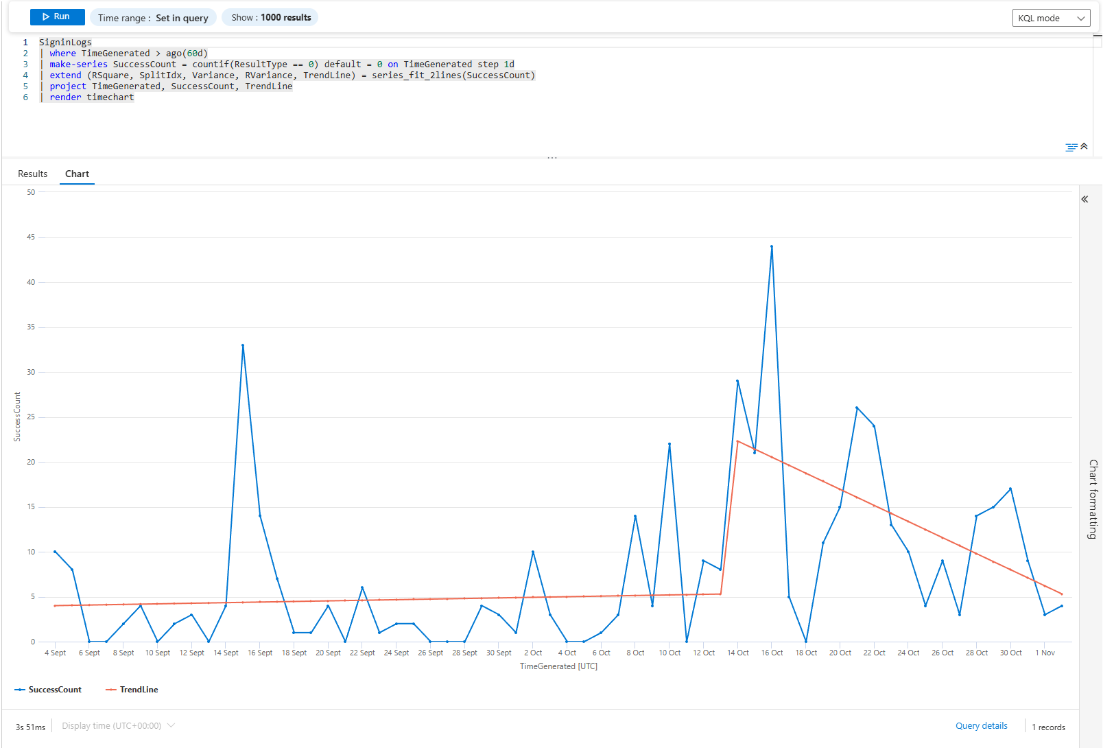
The series_fit_2lines function finds the break point. It's not a smooth average; it's a two-piece linear fit that catches the exact moment something changed.
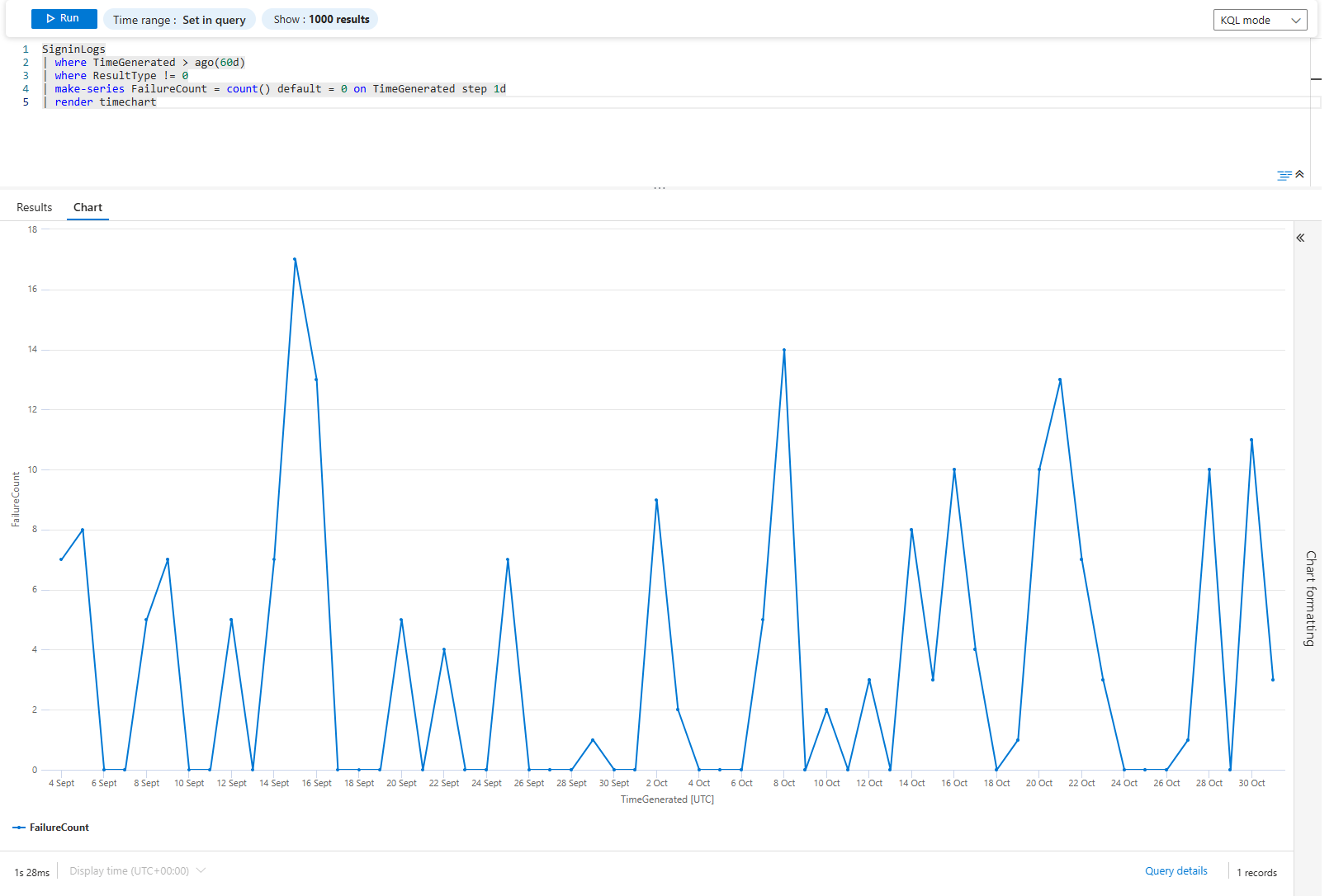
Now flip it: what about failures?
SigninLogs
| where TimeGenerated > ago(60d)
| where ResultType != 0
| make-series FailureCount = count() default = 0 on TimeGenerated step 1d
| render timechart
Just a line chart of failures over time. Flat line = consistent problems. Spiky line = intermittent issues. Climbing line = degrading. Each shape tells a different story and points to a different root cause.
Problem 2: Which Apps Leak Credentials Most Often?
Not all apps are equal. Some are brute-forced constantly. Some are legitimate but misconfigured. Some are abandoned and should be killed.
SigninLogs
| where TimeGenerated > ago(30d)
| where ResultType != 0
| extend App = AppDisplayName, Reason = ResultDescription
| summarize FailureCount = count(), DistinctUsers = dcount(UserPrincipalName) by App, Reason
| where FailureCount > 50
| top 20 by FailureCount desc
| render columnchart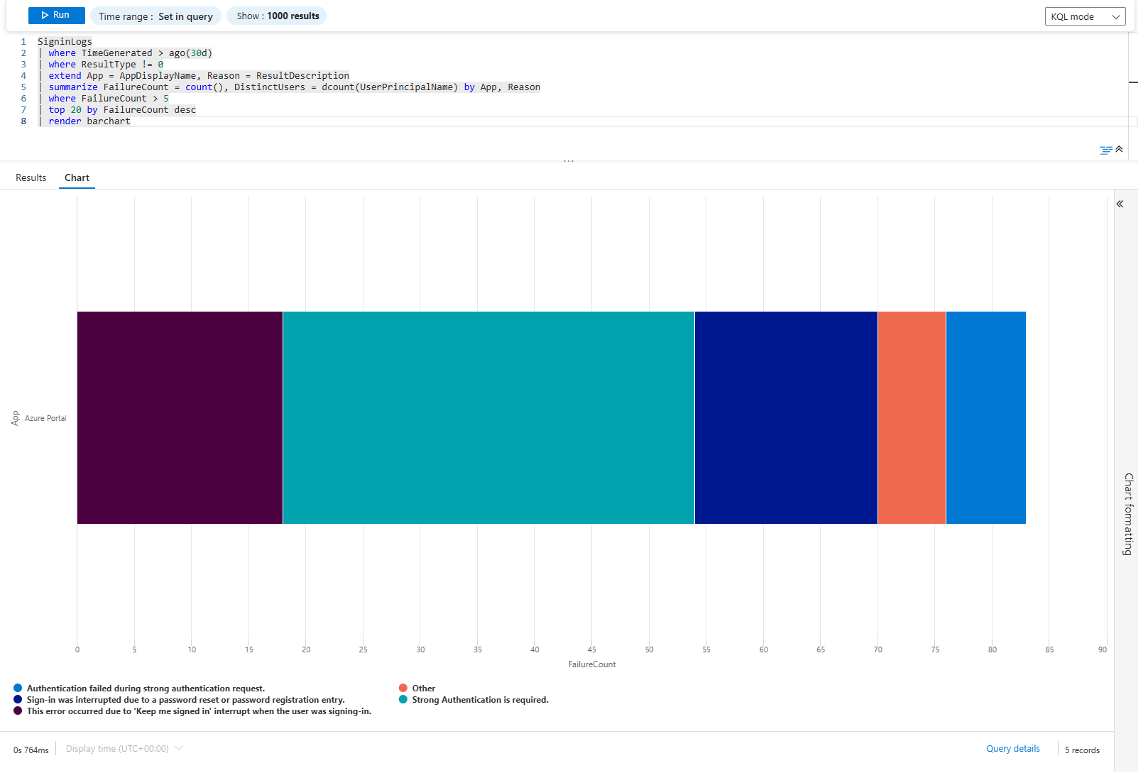
It's a simple count. Each column is an app+reason combo sorted by failure count. If you see: "Azure Portal - Invalid username" leads with 5,000 failures across 200 users. That's users. "Custom App - Legacy auth blocked" has 300 failures across 5 users. That's a forgotten integration.
The distinction matters. Users failing is a helpdesk problem. Integrations failing is an engineering problem.
Problem 3: MFA Adoption Is Stalled; Where?
You mandated MFA everywhere. Did it stick? Find out by location, by app, by user type.
SigninLogs
| where TimeGenerated > ago(90d)
| where ResultType == 0
| extend MfaRequired = AuthenticationRequirement
| summarize SigninCount = count() by MfaRequired, Location
| render columnchart with (kind = unstacked)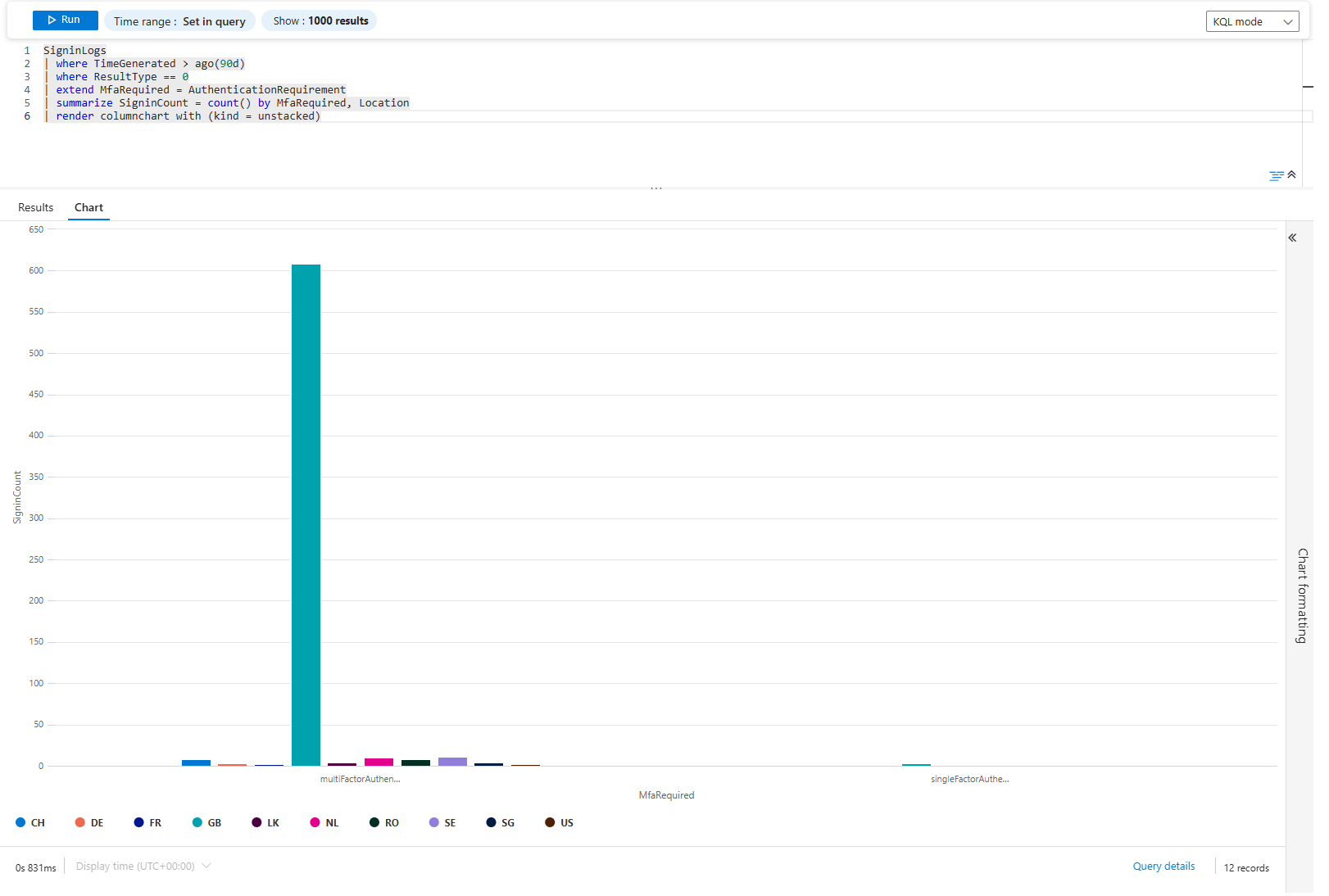
Unstacked columns show each authentication requirement side-by-side for each location. If London has 80% single-factor and 20% MFA, your conditional access policy isn't working there. If New York is 5% single-factor and 95% MFA, it's working.
Go deeper. Which users are still on single-factor?
SigninLogs
| where TimeGenerated > ago(30d)
| where ResultType == 0
| where AuthenticationRequirement == "singleFactorAuthentication"
| summarize SigninCount = count() by UserPrincipalName
| where SigninCount > 5
| top 20 by SigninCount desc
| render barchart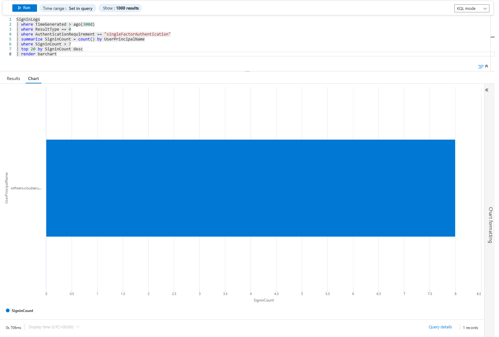
Bar chart of users still using single-factor. These are your targets for the next MFA push, or to check which applications exactly are using single-factor. If half the C-suite is here, that's your political problem. If it's test accounts and service identities, ignore them.
Problem 4: Service Principals Are Failing, Is It One Bad Moment or Continuous?
Non-interactive sign-ins are automated. They either work or they don't. There's no "user tried again."
AADNonInteractiveUserSignInLogs
| where TimeGenerated > ago(7d)
| where ResultType != 0
| summarize FailureCount = count() by AppDisplayName
| top 10 by FailureCount desc
| render barchart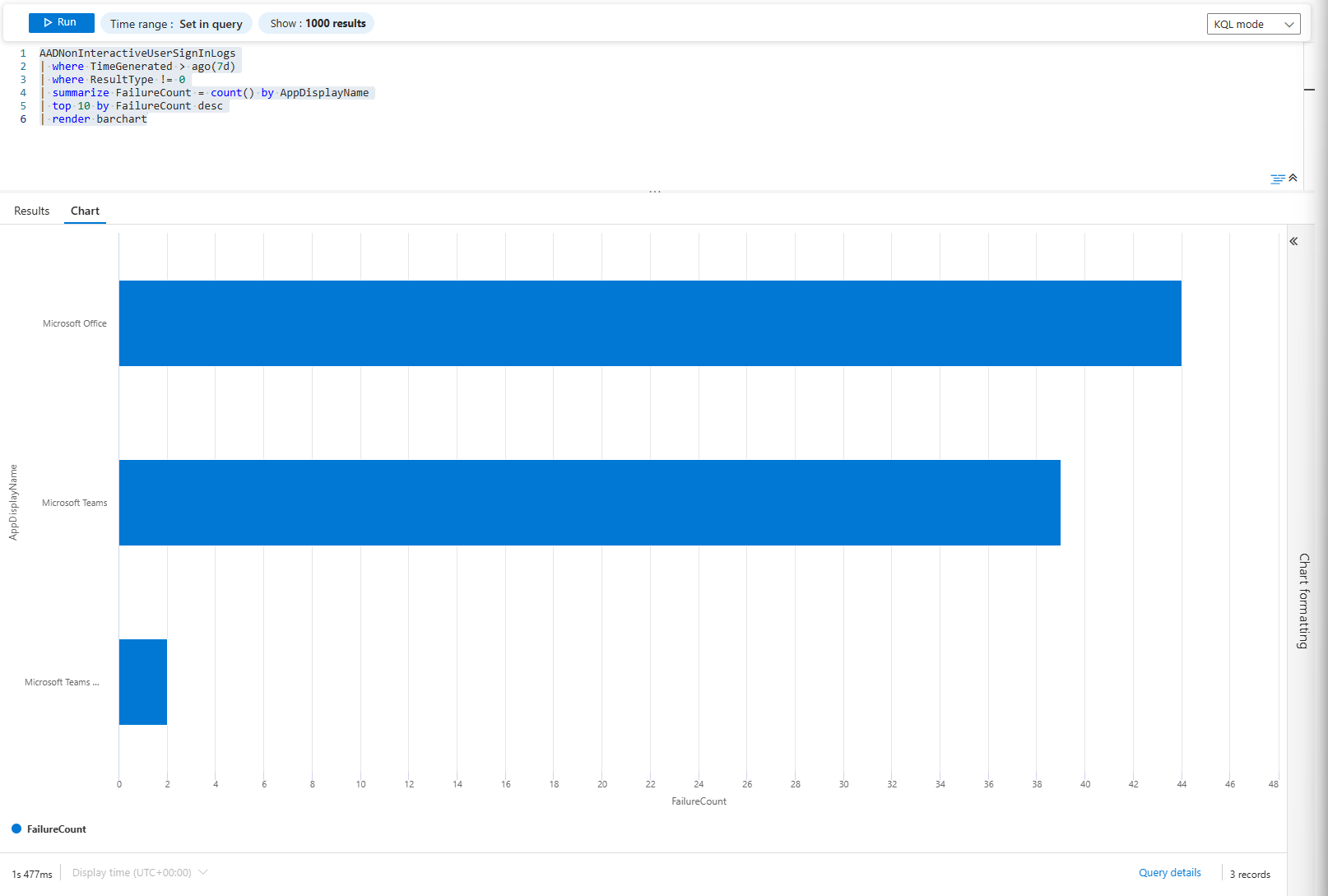
Quick view: Which applications seem to yield failures right now?
AADNonInteractiveUserSignInLogs
| where TimeGenerated > ago(7d)
| where ResultType != 0
| summarize FailureCount = count() by bin(TimeGenerated, 4h), AppDisplayName
| render timechart
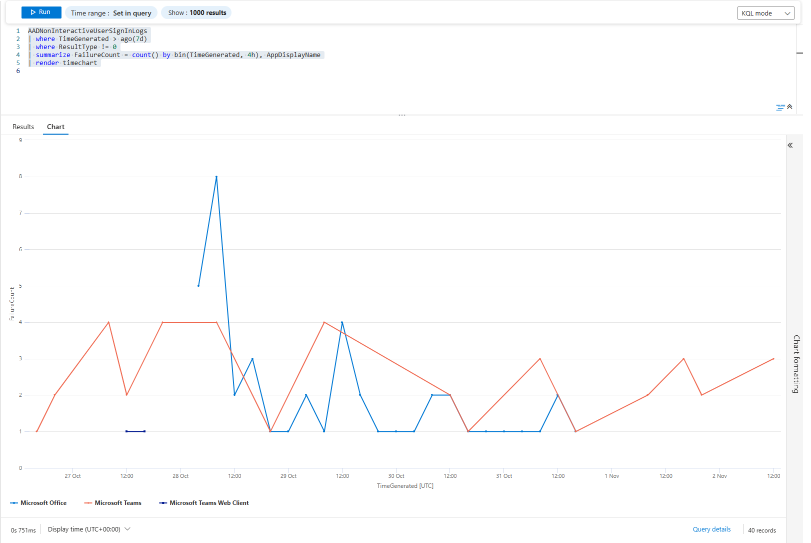
If a line is jagged (full of spikes), the service may be flaky, permissions intermittent, network issues, or timeouts. If a line remains flat for three days and then shoots straight up, maybe a deployment or a permission change occurred at that exact moment.
The pattern reveals the cause. Jagged = operational. Sudden = change. Flat then climbing = slow leak.
Problem 5: DNS Traffic Tells Stories. Which Stories Are You Missing?
Network activity is massive. But DNS queries are trackable and reveal behaviour.
DeviceNetworkEvents
| where TimeGenerated >= ago(90d)
| where ActionType == "DnsConnectionInspected"
| extend Query = tostring(parse_json(AdditionalFields).query)
| summarize QueryCount = count() by Query, RemoteIP
| where QueryCount > 100
| top 30 by QueryCount desc
| render columnchart
behaviour
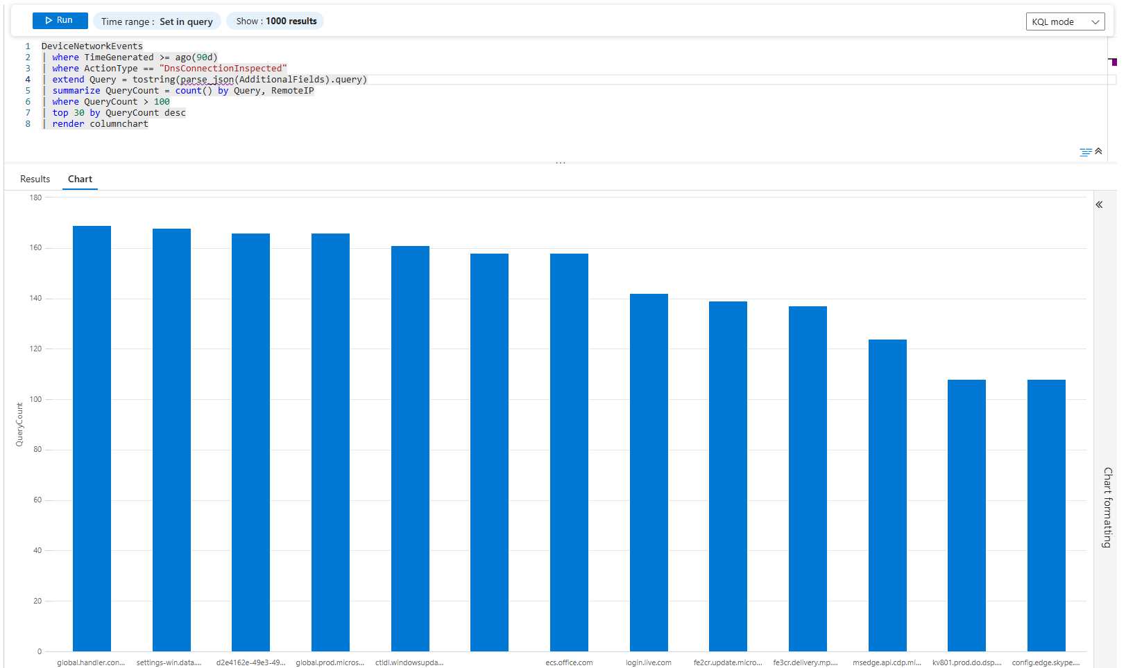
Top 30 DNS domains being queried. Most are legitimate (microsoft.com, google.com, cloudflare.dns). But if you see evil-c2.ru in the top 30 with 5,000 queries, you have a problem.
Now find which device is doing it:
DeviceNetworkEvents
| where TimeGenerated >= ago(90d)
| where ActionType == "DnsConnectionInspected"
| extend Query = tostring(parse_json(AdditionalFields).query)
| where Query has_any (".ru", ".cn", ".onion", ".io")
| summarize QueryCount = count() by DeviceName, Query
| where QueryCount > 5
| render barchart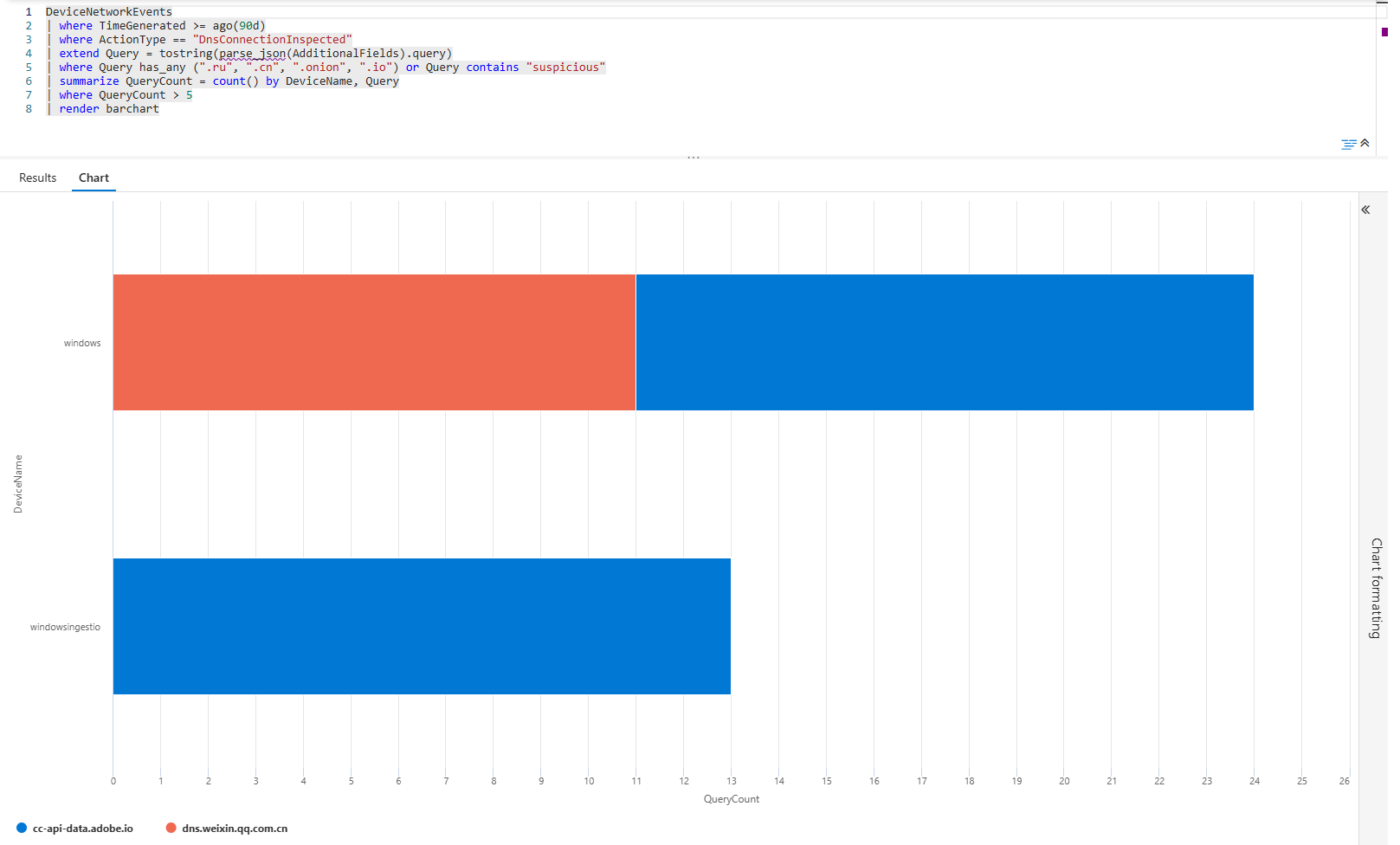
Bar chart of suspicious domain queries by device. Each bar is a device+domain combo. If your finance server is querying TOR domains, that's a compromise. If it's a dev machine, it's probably a dev testing VPN bypassing, but it needs review.
Problem 6: Vulnerability Backlog; What's Actually Blocking You?
You've got thousands of vulnerabilities. You don't have time to patch all of them. Which ones matter?
DeviceTvmSoftwareVulnerabilities
| distinct VulnerabilitySeverityLevel, DeviceName
| summarize VulnCount = count(), AffectedDevices = dcount(DeviceName) by VulnerabilitySeverityLevel
| render piechart
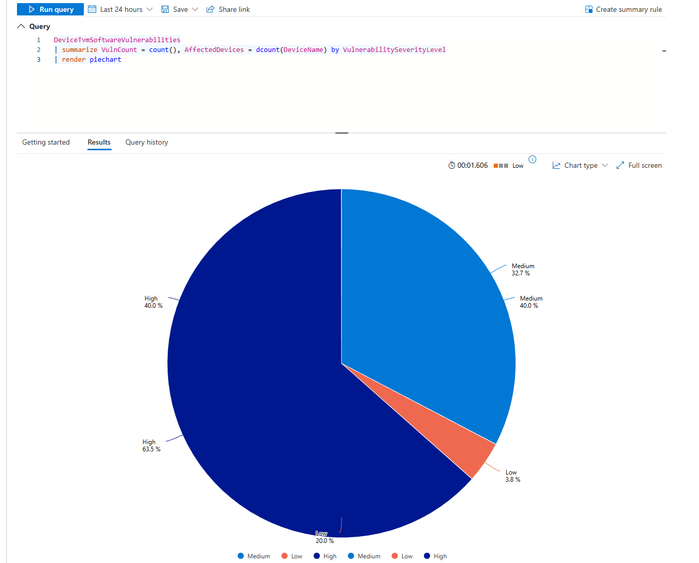
Pie chart of severity distribution. If 95% are low/medium and 5% are critical, your backlog is fine. If it's 50/50 critical/medium, you're in trouble.
Now find the actual culprits:
DeviceTvmSoftwareVulnerabilities
| where VulnerabilitySeverityLevel in ("Critical", "High")
| summarize VulnCount = count(), AffectedDevices = dcount(DeviceName) by SoftwareName, SoftwareVendor
| where AffectedDevices >= 3
| top 15 by VulnCount desc
| render columnchart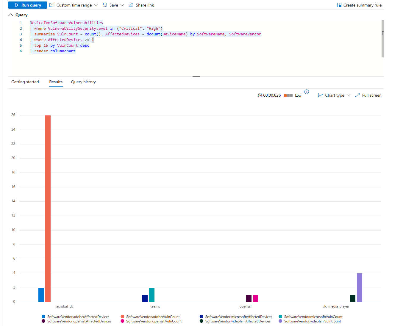
Each column is a piece of software. The height is the vulnerability count. If Adobe Acrobat has 200 critical vulns across 60 machines, that's your first priority. If Visual Studio has 5 critical vulns across 2 machines, that's your second.
Problem 7: False Positives Burning Your Team
Alerts fire constantly. Most are garbage. You can't tell which rules are broken until you visualise alert volume by rule.
SecurityAlert
| where TimeGenerated > ago(30d)
| where AlertSeverity == "Medium"
| summarize AlertCount = count() by DisplayName, AlertSeverity
| where AlertCount > 10
| top 20 by AlertCount desc
| render barchart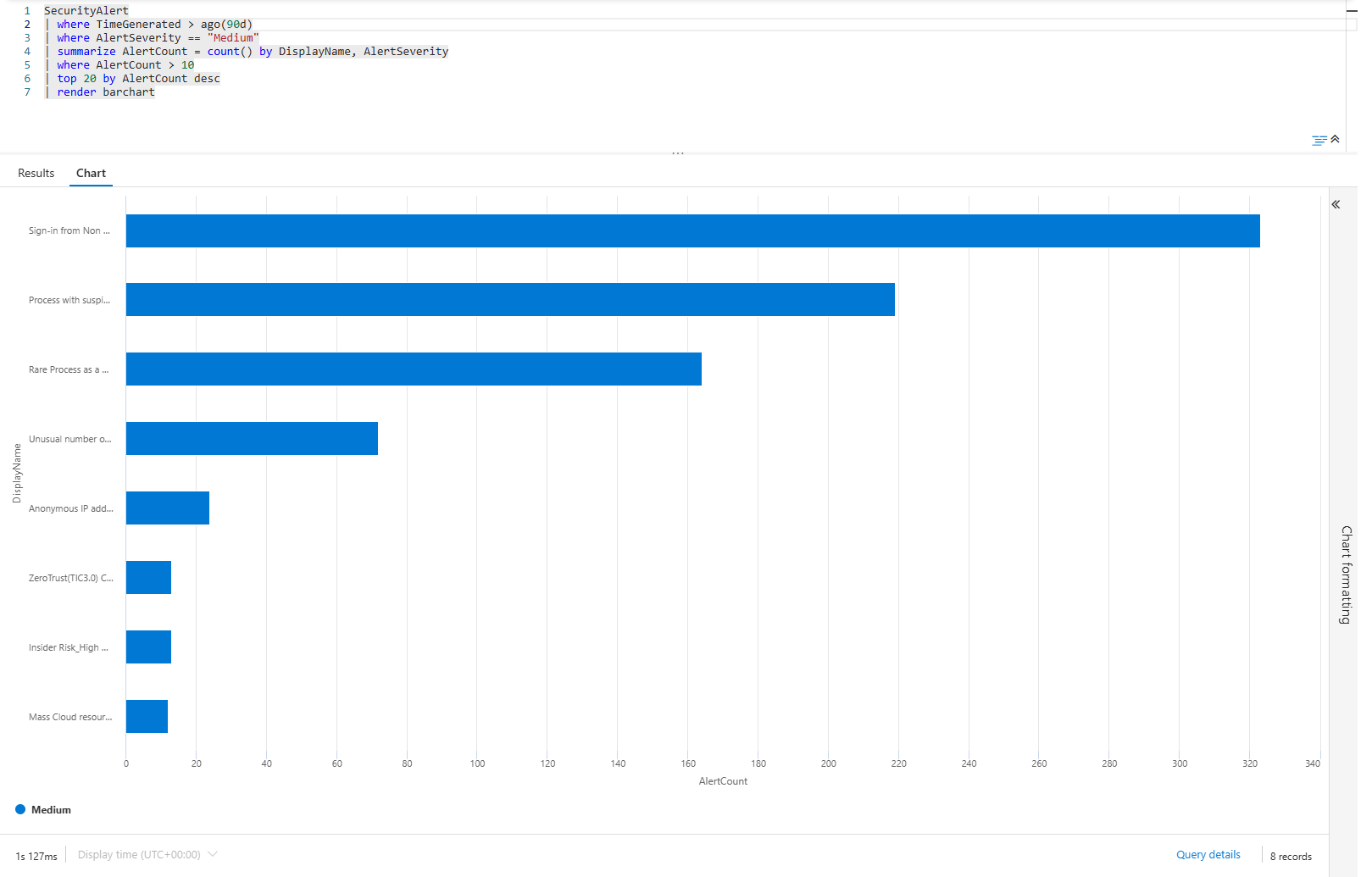
Bar chart of your top 20 medium-severity alert rules over the past month. If "Sign-in from Non-Compliant Device" has 300 alerts and everything else has 50, that rule is broken. It's generating noise that drowns out real threats.
Track which rules are getting worse:
SecurityAlert
| where TimeGenerated > ago(60d)
| where AlertSeverity in ("High", "Critical")
| summarize AlertCount = count() by bin(TimeGenerated, 1d), DisplayName
| render timechart
Each line is a rule. If a line climbs, that rule is firing more. If it starts flat and then shoots up, the environment has changed. If it's erratic, the rule is broken.
Use this to tune your alerts. Disable the ones that climb. Investigate the ones that spike.
Problem 8: Cost Explosion, Which Data Source Is Killing Your Budget?
Log ingestion costs add up fast. The Usage table tells you which data sources are expensive.
Usage
| where TimeGenerated >= ago(30d)
| summarize TotalGB = sum(Quantity) by DataType
| sort by TotalGB desc
| render barchart
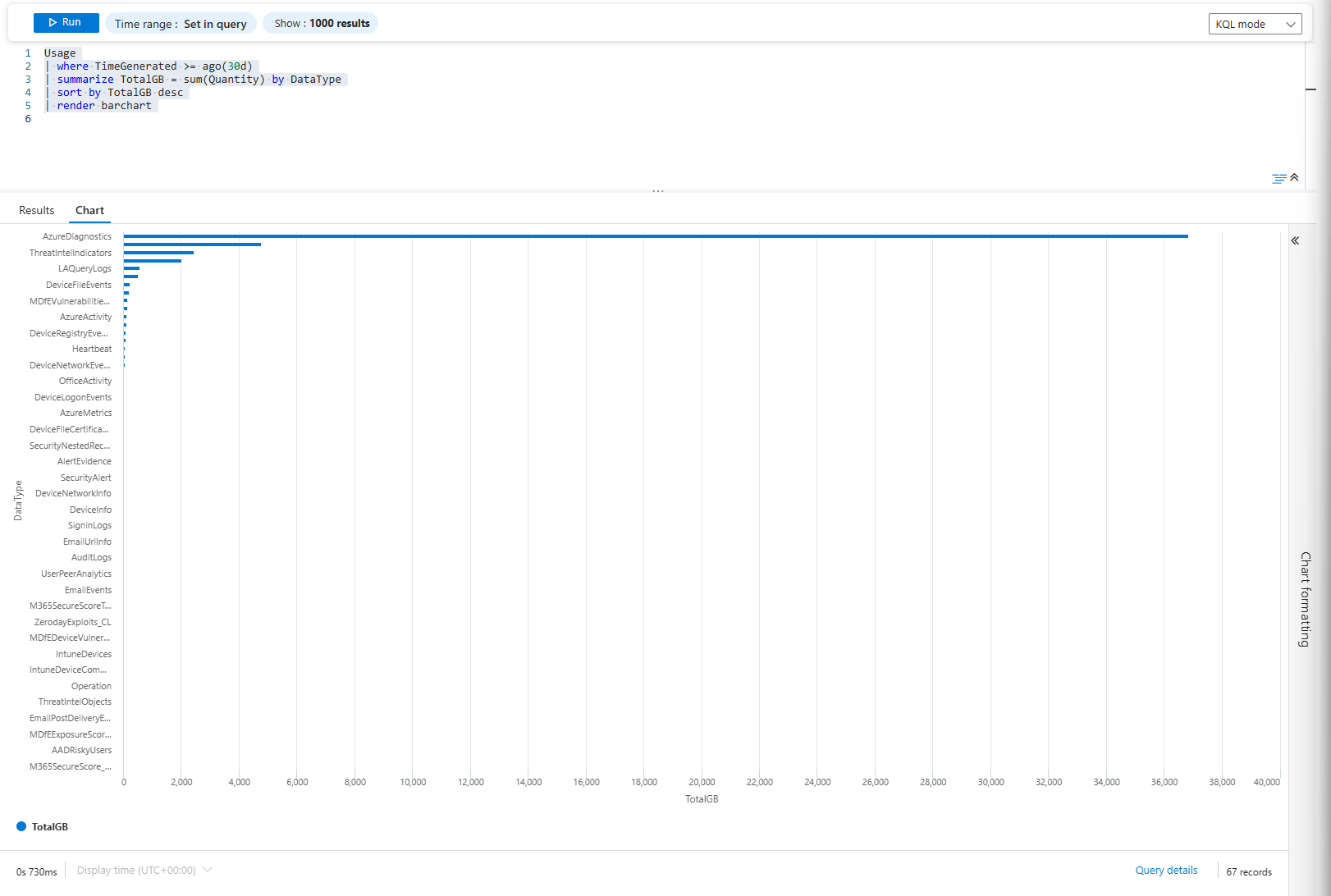
Bar chart of total ingested volume by data type. The usual culprits are Azure Diagnostics (possibly a firewall or storage accounts), Windows Security Events and Common Security Logs (your firewall)
Track it over time:
Usage
| where TimeGenerated >= ago(30d)
| extend Day = format_datetime(TimeGenerated, "yyyy-MM-dd")
| summarize DailyGB = sum(Quantity) by Day, DataType
| sort by Day asc
| render timechart
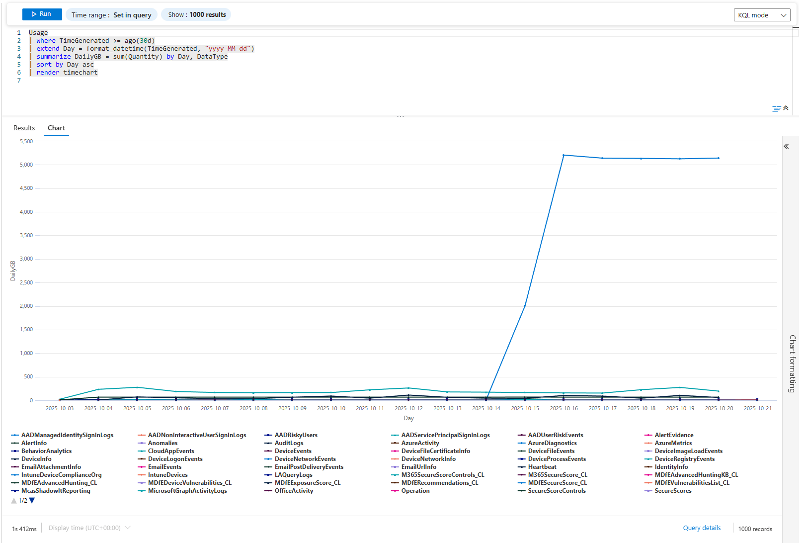
Each line is a data source over time. If AzureDiagnostics went from 20GB/day to 80GB/day, something is generating extra events. New Storage Accounts added? New Firewall? The chart shows when it happened. Then you investigate.
Problem 9: Compliance Trending; MFA Adoption, Passwordless Progress
Compliance isn't about today. It's about direction. Are you moving toward your goal or away?
SigninLogs
| where TimeGenerated > ago(180d)
| where ResultType == 0
| extend Month = startofmonth(TimeGenerated)
| extend MfaUsed = iff(AuthenticationRequirement == "multiFactorAuthentication", 1, 0)
| summarize TotalSignins = count(), MfaSignins = sum(MfaUsed) by Month
| extend MfaPercentage = round(MfaSignins * 100.0 / TotalSignins, 2)
| project Month, MfaPercentage
| render columnchart
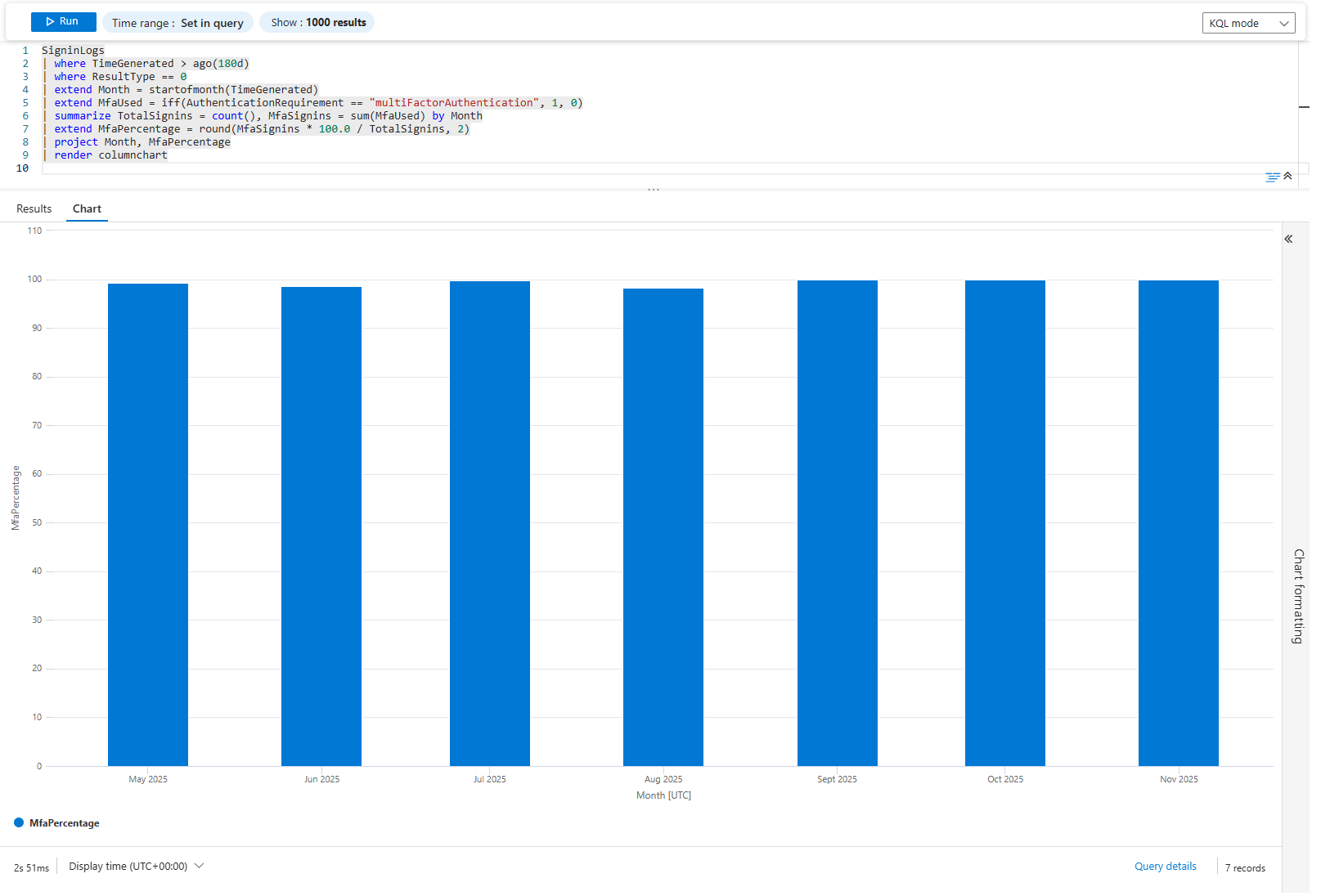
Column chart of MFA adoption percentage over 6 months. Each column is a month. If it's climbing (50% → 60% → 70% → 80%), you're winning. If it's flat or declining, your policy isn't working.
Do the same for passwordless:
SigninLogs
| where TimeGenerated > ago(180d)
| where ResultType == 0
| extend Month = startofmonth(TimeGenerated)
| summarize
    TotalSignins = count(),
    PasswordlessSignins = countif(AuthenticationDetails has "passwordless")
  by Month
| extend PasswordlessPercentage = round(PasswordlessSignins * 100.0 / TotalSignins, 2)
| project Month, PasswordlessPercentage
| render columnchart
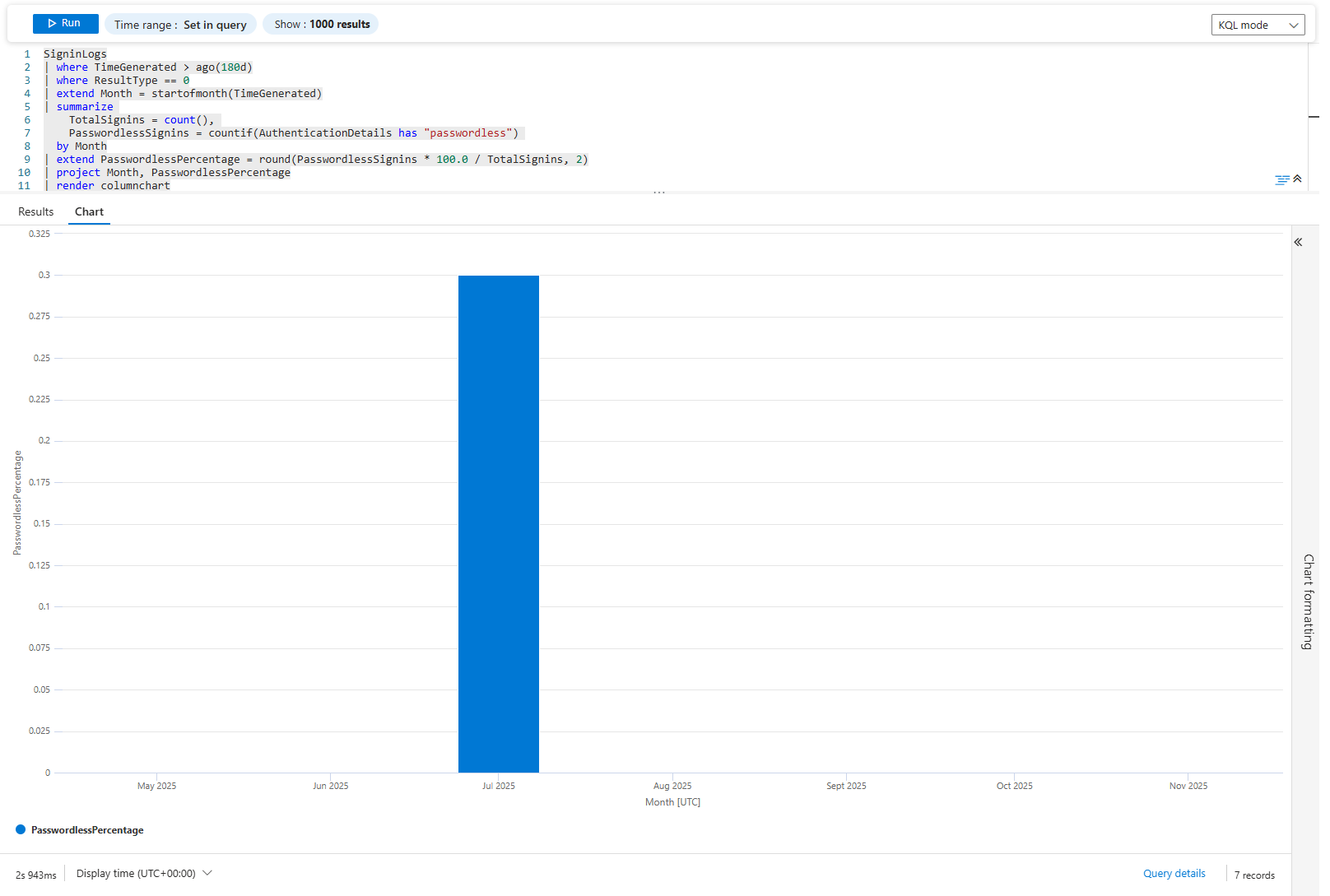
Same idea. If passwordless was 1% last January and 15% this November, your migration is working. If it's stayed at 2%, it's stalled.
Problem 10: Antivirus Lag; Finding Unpatched Engines
Defender updates are supposed to be automatic. They're not always. Find machines running old engine versions.
DeviceTvmInfoGathering
| where OSPlatform in ("Windows10", "Windows11")
| extend AvEngine = tostring(AdditionalFields.AvEngineVersion)
| summarize MachineCount = dcount(DeviceName) by AvEngine, OSPlatform
| where isnotempty(AvEngine)
| top 15 by MachineCount desc
| render columnchart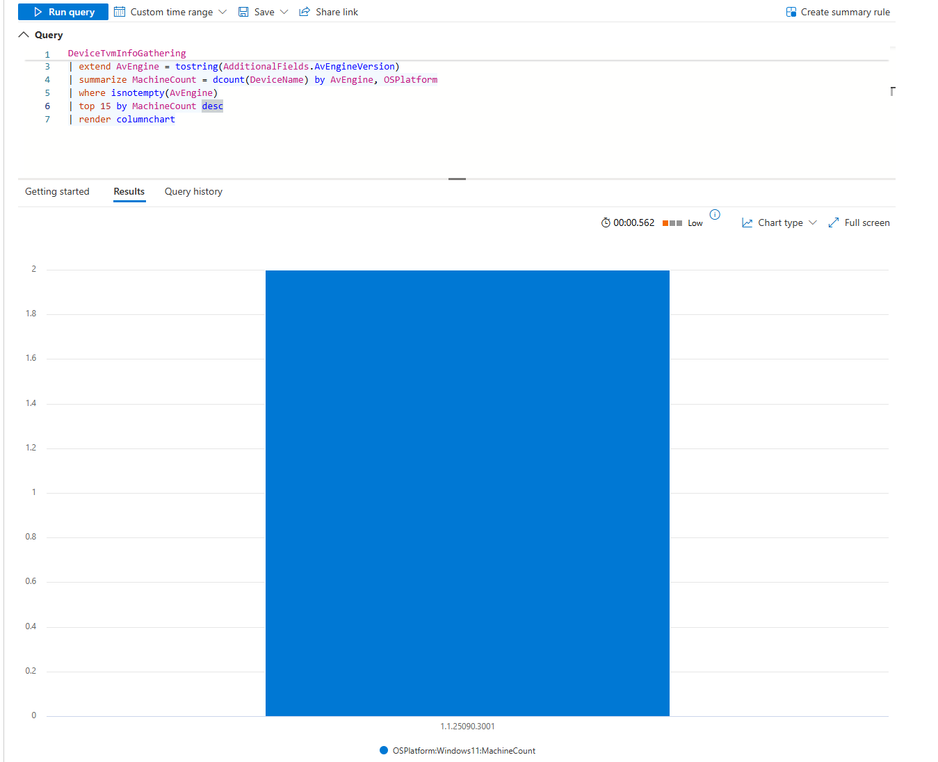
Column chart of engine versions. If most machines are on the latest but a few are running month-old versions, patch those machines. If 30% are old, you've got a deployment problem.
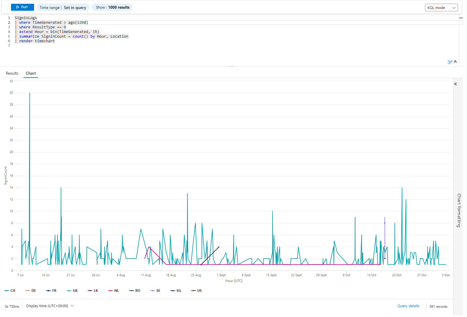
Problem 11: Geographic Anomalies; Impossible Sign-Ins
A user signs in from London. Five minutes later, they sign in from Tokyo. That's impossible. That's either credential theft or compromised identity.
SigninLogs
| where TimeGenerated > ago(7d)
| where ResultType == 0
| extend Hour = bin(TimeGenerated, 1h)
| summarize SigninCount = count() by Hour, Location
| render timechart
You Gotta Love this
Visuals are fantastic, they are your friend and should be utilised whenever you can I know that in a fast-paced world of SOC, it's hard to find a time to create those beauties, but they are well worth it.
Class dismissed